Fundamentals of Responsive Web Design for Better User Experience
- 5 Minutes to read
Table of Content
- What is Responsive Web Design?
- Benefits of Responsive Web Design
- What are the Elements of Responsive Web Design?
- Top Tips for Implementing Responsive Web Design
- Summary
- FAQs on the Benefits of Responsive Web Design
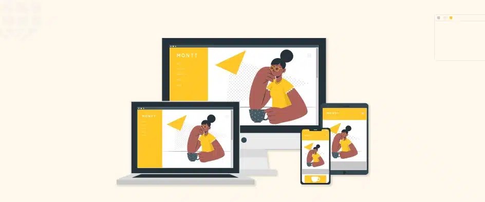
Nowadays, when creating a website, one of the most significant things to consider is a responsive web design. The top web design companies incorporate this tactic to ensure a website adjusts to any screen size or browser. This means users have an optimal online experience, no matter if they are on a desktop, laptop, tablet or mobile.
A great benefit of responsive design is improved user experience. Sites that adapt to different devices make navigation and finding what you need easier. That leads to better customer satisfaction and more time spent on the site. It also brings higher conversion rates.
Wondering what other benefits responsive web design offers to your website? Well, follow this blog and find out.
What is Responsive Web Design?
Responsive web design or RWD is an approach to web design that aims to make pages of a website render well on several devices and window or screen sizes to ensure usability and satisfaction.
A responsive design adapts the web page layout to the viewing environment by using techniques like, flexible images, fluid proportion-based grids, and CSS3 media queries.
Fluid grid concept: The fluid grid concept dictates page element sizing to be in relative units such as percentages instead of absolute units such as pixels or points. This allows the elements to resize themselves automatically based on the size of the screen they are being viewed on.
Flexible images: Web designers size the flexible images in relative units to ensure they aren’t displayed outside their containing element. This ensures that they will always look good, no matter what size screen they are being viewed on.
CSS3 media queries: These media queries allow you to specify different style rules for different screen sizes. This is useful for things like hiding or showing certain elements on smaller screens, or changing the layout of the page altogether.
If you are thinking about redesigning your website, or if you are launching a new website, responsive web design is the way to go. It is the best way to ensure that your website will look captivating and be easy to use on all devices, now and in the future. And the benefits of this strategy are immense.
Benefits of Responsive Web Design
Responsive web design offers amazing advantages for businesses and individuals. It adjusts to almost all screen sizes and devices for a better user experience and more accessibility.
- Improved user experience: Responsive web designs make it easier to use sites on all devices, leading to increased visitor satisfaction and engagement.
- Increased reach: Websites with responsive design can be accessed by users on a wider range of devices, expanding your potential audience.
- Improved SEO: Search engines such as Google prefer websites with responsive design, as they provide a better user experience. This can lead to improved SERP rankings and increased traffic to your website.
- Reduced costs: Responsive websites can save you money in the long run by eliminating the need to maintain separate websites for different devices.
Simply put, responsive web design can ensure your website will deliver the best user experience, whether it’s on a computer, tablet, or smartphone. And the users will be able to open them on every web browser. Plus, it adapts to new tech like voice search and smart devices. This ensures businesses stay ahead in the digital world.
What are the Elements of Responsive Web Design?
Responsive web design is one of the top web development trends. It ensures the website and all of its pages render well on all devices and screen sizes. For that, there are three key elements at work:
Flexible grid: A flexible grid is a layout system that uses relative units, like percentages, instead of absolute units, such as pixels. This allows the layout to adapt to all screen sizes without breaking.
Flexible images: Flexible images are images that are resized to fit the container they are in. This prevents images from becoming too large or too small on different devices.
Media queries: CSS rules that allow you to change the style of your website based on the device used by the user, are called Media queries. For example, you could use a media query to hide certain elements on smaller screens or to change the layout of the navigation bar.
In addition to these three key elements, the top web development service providers do a number of other things you can do to make your website more responsive. That means using relative font sizes instead of absolute font sizes. You should also go for fluid typography and use white space effectively. We’ll discuss more of the quick tips in the next section.
Top Tips for Implementing Responsive Web Design
Now that you get what responsive design is and what its benefits are, it’s understandable that you should implement it on your website. So, what are the top tips for implementing responsive web design on your website? Let’s check out.
- Prioritize mobile-first. That means designing your site for the smallest screen size first and then scaling it up for larger screens.
- Use a single CSS file for all devices. This will help to keep your code clean and organized.
- Use progressive enhancement. This means starting with a basic website that works on all devices and then adding enhancements for newer devices and browsers.
- Use a responsive framework. This can save you a bunch of time and effort, as they come with a pre-built grid layout and other features that make it easy to create a responsive website.
- Use a flexible grid layout. This will allow your content to adapt to different screen sizes without breaking.
- Use relative units instead of absolute units. This will ensure that your content is sized appropriately for the device it is being viewed on.
- Use flexible images. This will prevent your images from becoming too large or too small on different devices.
- Use media queries to change the style of your website. It’s based on the device the website is being viewed on. This can be used to hide or show certain elements or to change the layout of your website altogether.
- Use fluid typography. This means using different font sizes and line heights for different screen sizes.
- Use white space effectively. This will make your website easier to read and navigate.
- Test your website on a variety of devices and screen sizes. This will ensure that your site looks good and works well on all of them.
By following these tips, you can create a responsive website that will provide a great UX for all of your site visitors, regardless of the device they are using.
Summary
Responsive web design is vital in today’s digital world. It allows sites to adjust easily to different screens and sizes. This ensures users get the best experience. Plus, it improves search engine visibility and increases website traffic, resulting in better sales and revenue.
Responsive design also helps businesses reach a larger audience. By targeting mobile users, companies can connect with a huge market and improve conversion rates. With more smartphone users every day, not catering to mobile users would be a huge mistake for businesses.
And, you won’t have to develop multiple versions of a website for different devices, saving time and money on the development and maintenance. So, do you want to implement responsive web design on your website? Then, follow our blogs and go for it.
FAQs on the Benefits of Responsive Web Design
1. How does responsive web design work?
Responsive web design uses flexible layouts and design principles that adjust and adapt based on the screen size and capabilities of the device accessing the website. This is achieved through the use of media queries, fluid grids, and flexible images.
2. Can I update my existing website to be responsive?
Yes, it is possible to update an existing website to be responsive. However, depending on the complexity of the design and the underlying code, it may require significant modifications or even a complete redesign. It is best to consult with a professional web developer to ensure a smooth transition.
3. How can I test if my website is responsive?
There are several tools available to test the responsiveness of your website. You can use online tools like Google’s Mobile-Friendly Test or resize your browser window to see how the site adapts to all screen sizes. Additionally, you can also test your website on various devices to evaluate its responsiveness.
Related posts

Complete Guide to Mobile App User Retention
Unlock the secrets to keeping your users engaged! Our guide delves into effective strategies for boosting mobile app user retention, from enhancing the onboarding process to leveraging personalized experiences. Discover actionable tips to transform one-time users into loyal fans.

How Much Does Android App Development Costs?
Diving into Android app development costs, we explore factors influencing expenses, from app complexity to developer location. Learn strategies to minimize costs and navigate FAQs for effective budget planning in app creation. Join us to demystify the costs behind Android app development.

Types of Online Advertising: All You Need to Know
Dive into the world of online advertising and discover its various types, from display ads and SEM to social media and interactive advertising. Learn how each type can boost your brand’s visibility and why they’re essential in today’s digital age.